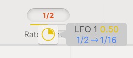
They really need to do something about the AUGMENTED interfaces. Not only darkmode. But it is getting really messy. i mean… that yellow on that light grey?:
4 Likes
They put an advert on FB publicising their Augmented series and I couldn’t resist to post a response saying that over here on the official forum we’ve been requesting dark mode for over three years, and it just seems to be in the backlog of a Jira board forever.
All we’ve ever had is ackowledgement in July 2023 that it’s been added as a feature request.
Their interfaces are not at all helpful for people with colour-differentation issues. They are in clear breach of WCAG 2.2 guidelines, for no justifiable reason at all, considering these are bespoke apps that aren’t purposefully mimicking the design of vintage hardware.
Although WCAG is to help direct the design of web content not downloadable apps, it takes a special kind of ignorance to design an app that completely breaches the guidelines…
2 Likes
In NI Komplete Kontrol or Kontakt and on corresponding screen of NI KKS it’s still impossibile to read the current preset written in white on quite white background… Arturia certainly expects we remember all of them 
I just filled out my customer response questionnaire for Augmented Persia, if they read it they will hear about illegible text contrast and dark mode again… 
2 Likes
The more people officially bring it to their attention the more likely it will get remediated.
This thread is early 3 years old now and still no dark mode.
I seriously doubt we are ever going to see a dark mode in any Augmented series (and all other Arturia plugins that blind us with science).
2 Likes
A big +1 for adding a darkmode GUI!
1 Like
Yes, dark mode and readable color for the name of current preset in NKS.
3 years we ask for it, what a pity Arturia 
1 Like
So we have entered year 3 since this was flagged as an issue. I’m starting to wonder if the whole Augmented thing is becoming abandonware. But if they do produce another and the UI hasn’t improved, I don’t know whether I’ll rant or cry…
I know there are more people out there than us who feel this way.
2 Likes
I definitely don’t think Augmented stuff is abandonware. Arturia have mostly ran out of vintage synths to emulate, because the IP owners of all the ones that are obviously missing, such as the Roland D50 and Korg M1, probably won’t grant licences because those companies market their own VSTs. So Arturia’s only future in terms of new VSTs is new versions of the emulations they already make plus stuff like Pigments, Augmented and the Pure Sub (there will be probably more Pure X products).
1 Like
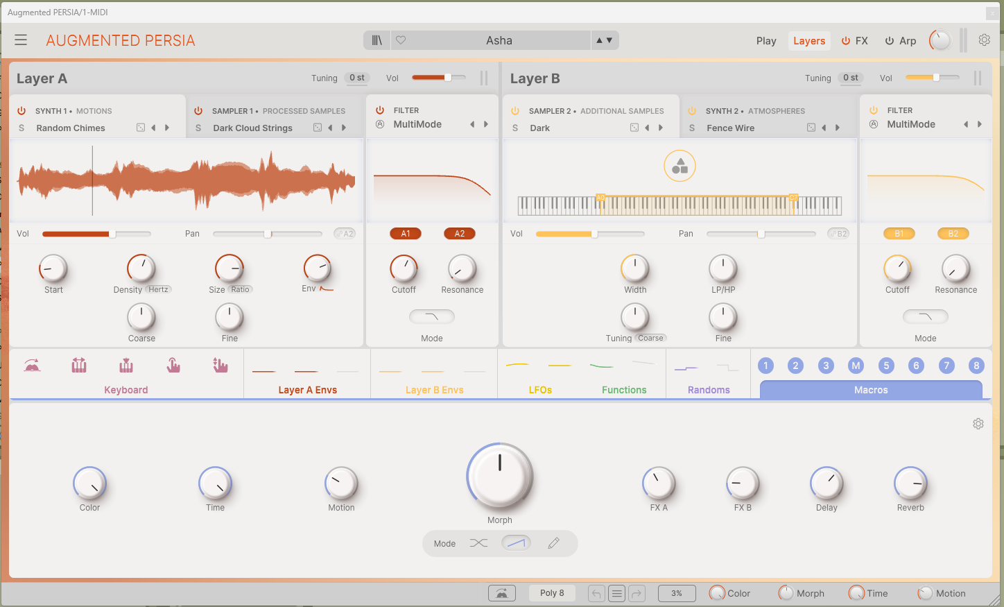
Inverting the colours is an option but we shouldn’t have to do that.
I agree. This is a heartbreaking experience with ColdFire too. I really like these tools, but I literraly can’t see it. Inverting the screen also inverts other windows that are already in dark mode, so its still a pain. I don’t get why they could do it with Pigments, but not Augmented series.
I get that it may increase file size because graphics are a ton of pictures rather than vectors in JUCE, but then the ultimate design choice should be made here. Maybe users won’t miss the bright interface, but care more about the functions being visibly safe for long hours of use.