I say this in the spirit of someone who likes the sound of your instruments and wants them to be as good as they can be. Can you please consider how very small fonts impacts the user experience? I started to notice it with Pigments, where some of the fonts are quite small and indistinct. Then Minifreak V came out and the vertical fonts on the matrix section are also small and hard to read.
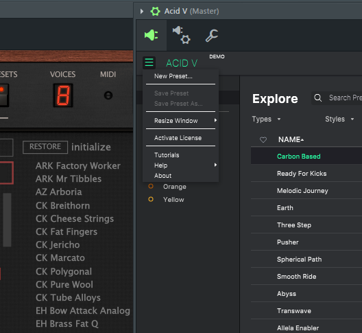
Today I just tried the new Acid V and to make the plugin fit comfortably on my screen I have to reduce the GUI to 60%, which makes the already smallish fonts in the preset browser very small and difficult to read at a glance. Below is a picture comparing fonts with u-he’s Repro 5 at the same GUI size. You can see Repro is much easier to read. I hope this is something you will consider, thank you.
Hi Synth, yes it sound very understandable. Let’s see if Arturia can fix that cause if you have a little screen it came very difficult to read, that’s why I buy a big monitor
(if using Windows ) Have you tried altering the scaling settings in the ‘Scale and Layout’ part of your ‘Display Settings’ ?
(Mind you setting scale setting to 150% and beyond will makes some apps start complaining or can make program navigation difficult in as much as it can make some program windows have size beyond displayed area)
Also if your screen is widescreen (e.g. 16:9) then 27" is actually not that big.
You will find that a 27" widescreen 16:9 is not taller than a 4:3 standard 22" :
So if you use 16:9 aspect ratio and want some big pictures then you may want an even bigger screen.
People tends to forget basic things such as resolution and aspect ratio when thinking that things looks really small. Prior people thought that things looked really big on their 19"/21" screens but tends to forget that back then they maybe only used 1024X768 as screen resolution.
_Need help ?
When you can't find the answer online or in the product manual, the Technical Support Team is here!.
_Stay tuned
Follow us for the hottest sounds, fresh content, exclusive offers and Arturia news as it happens.